


|
|

|
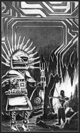
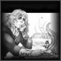
Strange Publishing History: I've debated one way and another whether or not to include this section. I fear it comes too close to whiny for my taste and pride. On the other hand, what happened to the Groundties books is far from unique and the details seem to have given my readers a lot of insights into the business of publishing. So...since I get a lot of questions on the matter, I decided to include it. Too much, too soon: Within a couple of months, I had a three book contract. That's too fast. In retrospect, I should have waited until I had all three books done and could present the entire project to a prospective publisher, so whoever made the decision to buy or not would know exactly what they were getting into. When I sold the project to Warner the real ramifications of The Deadly Question were just beginning to manifest. I don't know what my editor thought he was buying, but I suspect the final project was both longer and more complex than he'd imagined, for all I made no secret right from the start about the fact that it was a first draft and that things would get far more complicated, and that, yes, every scene in there really did have a significant function in the overall story arc. So, he had fair warning, but I think we were both somewhat naive to have leapt into the contract. I also should have waited until I was "comfortable" in my writing skin and could proceed with this writing thing at a pace that would put at least one new book a year on the shelves. As it was, my first book was in schedule before it was done with the other two scheduled for rapid six month follow-ups. This meant I not only had to write my newly-acquired writing behind off, I had no backlog of novels to keep my presence on the shelves active. And I was headfirst into the deep ocean before I learned how to control my dinghy in the swimming pool. Both my series have been long and complex, that being the kind of story "native" to my rather convolute brain. In order to make the causality and characterization and motivation flow smoothly, these require lots of rewriting. Translated, that means they take a long time to write. One book every couple of years is not conducive to a healthy career and building numbers. I figured out how to tame those innate story-telling tendencies a bit for short stories, but for novels, I was deep into my second series (The Dance of the Ring books from DAW) before I began to truly comprehend the problem. I was pretty much stuck in the gerbil's exercise wheel until I finished that series. Had I not sold Groundties so fast, establishing myself as (if you will) a "publishable author," I might well have come to this conclusion much earlier and managed a standalone, more accessible novel for my first published novel. But another truth is, I wouldn't be the author I am today had I not allowed the Groundties muse free rein and finished that series the way it wanted to be. If I'd tried to do too much "thinking" during the genesis of that first novel, I'd never have kept writing. For me, writing had to be from the creative gut first and the editorial head second. Now, knowing the joys in store during the creative process, I can handle controlling the muse a bit more specifically. But I had to learn what "creative writing" felt like, first. But the fact is, it did sell fast, for whatever reason, and in retrospect, Warner/Questar in 1991 was most definitely not the optimum spot for it. Publisher Presentation: Let me clarify that I was not alone in this situation, and neither is the Warner Books of 1991 unique. Also, the Warner\Aspect of 2001 is not the Warner\Questar of 1991. The problems I experienced with Groundties do not seem to have carried over to the new imprint at all. In retrospect, it seems to me that Questar was trying to do too much, splitting their staff's energies between original SF/F, various media tie-ins by established SF/F authors, and original work by gaming tie-in authors. The effect of this lack of imprint focus was hard enough on their established writers' books. For first novels, even those with really marketable "hooks", it was downright devastating. Groundties had no such easy "hook." Groundties would have required creative marketing no matter when it was published. What Groundties got wasn't enough to dampen, let alone saturate, its potential market. The Great Demon: Length: I never imagined length would be a problem. Boy, was I wrong. The only input I got from my editor was "Make it shorter---Warner won't publish a first novel that long." The end result was a tightly written book that's just a bit too intense for a lot of readers. The "down time" that could take the pressure off the characters and give the readers time to absorb that which had just taken place all had to be edited out. The great god Accessibility took a major hit in that one publisher decree. Perhaps if I'd been more experienced I could have both kept the substance and pared it down, but I don't think so. Even today, looking at it with an eye to rewriting for a new edition, I think I'll need another 5,000 to 10,000 words to appease Accessibility. Groundties ultimately came in at about 135,000 words. Fairly average now for Warner/Aspect, and not long at all for other SF/F houses at that time, but even that caused problems in a publishing house that was looking increasingly toward the tie-in market that comes in at the 80,000-100,000 range, and generally seeks about a fourth-grade reading level. Light, easy access books. To take Groundties to that size and reading level would have gutted it totally. Length problems notwithstanding, there was a far more significant drawback to being with Warner in the early 90's. Puffs: To digress a moment, one of the things I respect most about Ms Jones and why I feel free to reference her in this context is how honest and openly appreciative she is of the treatment Warner has given her books. Too many authors who receive such marketing perks seem determined to convince the world afterward that they did it "all on their own." I respectfully submit...They haven't got a clue. All the above are "flags" to the store owners about what books they must have on their shelves to appease the customers who have seen the ads and reviews. Groundties not only had no pre-pub solicitations (let alone loaves of bread), after publication, Warner actively refused all requests for review copies. Why? Well, not to point fingers, but right about that time and elsewhere in their multi-imprint corporation, Warner was coming out with a couple of notoriously expensive acquisitions they'd made on spec which, when the final product arrived in house proved...less than expected. One might even call them potential bombs. My understanding is that Warner made the (probably wise) decision not to send out review copies of these two books and trickle down seems to have stopped all review copies, at least for the couple of years in question. Whether or not that's true, I do know from many reviewers over the years that not only did they not receive copies of the Groundties books, requests for review copies were ignored. Since by the time I discovered that lack of the most basic support my editor was gone from Warner and the Questar line itself had dissolved, I never really got a chance to ask why. And the point is moot, now. The point is, where things like reviews and puffs might not ultimately affect an individual reader's inclination to pick up a book and try it, it most definitely affects the decision of the individual store-owner to stock the book in the first place. Advertising: or...Yes, Virginia, billing does matter...In what little advertising Groundties saw, it was put in as a footnote to the month's "lead" title, an Indiana Jones spoof by a gaming writer. I never read the book, and I'm sure it's delightful, but one of the realities of book marketing is that a hard SF first novel (especially, I'm sorry to say, an SF novel by a woman) placed beneath such a title is an automatic clue (along with the total lack of reviews and puffs) to the store-buyers that this is shelf-holding cannon fodder and to ignore the title and the author. And ignore it they did. Warner Questar in 1991 was an unfortunate place to be for any serious SF novelist, for a first novel, let alone a series, it was devastating. Warner wasn't taking chances, and Groundties, by its very nature, was not an easy sell. Marketing would have had to get creative, and Warner Marketing was busy elsewhere. The lack of imprint focus so undermined the credibility of the Questar line, it came as no surprise when Warner closed the Questar imprint the following year and started "a whole new SF line" ...Warner Aspect...leaving all of us from those final couple of years with Questar severely damaged goods in the ruthlessly numeric calculations of the bookstore computers. A question of series... Again, this philosophy was by no means unique to Warner, but it was a definite factor in the history of the Groundties books. Fortunately in this sense, publishers like DAW books, Inc have a better understanding of their SF market, a market that traditionally thrives on connected books. Others, including Warner in its new incarnation, are beginning to appreciate that fact. But, oh, if only the problems had ended here... Cover woes. Every author has them. Between the three Groundties covers and the first Ring cover, you can apply just about every one you've ever heard. Groundties. First of all, they got my name wrong. Of course, my editor and I never discussed that question. I'd have loved some help deciding on an effective pen name, but...whatever it was, it should at least have matched the interior---not to mention how they listed the subsequent books. Books in Print is (or at least was the last time I checked) totally confused. Suffice to say, looking up one book did not ensure you'd get the information on others. I did suggest a "theme" for the covers which (wonder of wonders) they actually used. Sortof. I wanted the computer chip superimposed over every cover, firmly establishing the underlying element of the stories and their hard SF core. Unfortunately, on the first book, book design completely covered the chip with huge type. I've heard from many readers who never even picked up Groundties because they assumed it was fantasy. But they got into the series too late with one of the other two, whose computer chips were highly visible and (thanks to the above backlist support question) were never able to get the first book. Visually, I can't complain terribly much about Groundties' cover---I really wanted the Miakoda moonrise, and that's what Barclay gave me, but I'd have liked a GLG on the cover. These books are Stephen's story after all, a young man whose rather remarkable appearance causes him way too much trouble. Anevai (the young woman depicted) is an important but definitely secondary character in the books. More significantly, a female SF writer still has an uphill battle for readers and this cover sent out all the wrong signals to those who even realized it was SF. As several potential readers have pointed out to me, the only female the back cover copy references is Cantrell, the starship admiral. And on the cover, they have an obviously young woman. The combination of elements smacked far much too much of feminist role reversal in a young-people-rule military SF fantasy...neither of which could be farther from the truth. (One of these days I'll write up my philosophy of character and gender for the write box---it's much too lengthy to digress for here.) The female on the cover was one of those unfortunate "If only we could have talked before it was painted." moments. It was a no-win combination. Had Barclay put Anevai in her Recon clothing to negate the "Starship Admiral" perception, it would only have enhanced the fantasy misconception. Basically, I'd have preferred Stephen in his irridescent blue jacket...with maybe the shuttle flying down the valley. But overall, it wasn't a bad cover. UpLink, on the other hand...that cover, for the book, was bad---and Barclay and I did talk about it beforehand. Computer chip theme notwithstanding, UpLink had nothing that linked it visually to Groundties. It was bad enough Warner wouldn't come right out and say it was the sequel to Groundties, the covers looked like vastly different types of books. Beyond that, the melting face cover is just...wrong. Based on that cover I've had many queries as to how I could have included the artist, Barclay Shaw, in my dedications in the last book. The answer is very simple: that cover isn't Barclay's fault. First of all, Barclay didn't get to read UpLink prior to painting the piece, but he very kindly called me and we talked about it. I explained how my ideal cover would be a Native American style Katchina doll in the foreground with computer chip leads for feathers linking it to the computer chip background, with Nayati in the Cocheta caves as the midground. Barclay was very excited about that concept but we had to come up with a couple of others. In the subsequent conversation, I explained how the book was very much about Stephen's psychological ... I might have even used the term meltdown ...and rebuilding. Possibly I should have used different terminology.
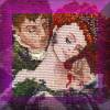
This is Barclay's sketch for the Katchina doll concept, taken from his trading cards. It links to a black and white of the full image, showing the leads and computer chip. The B&W is the photocopy he sent me when he had to break the news about the cover. (Please note, it is just a concept sketch, not a fully rendered painting, as they say.) For those of you who've read it, wouldn't this have been infinitely preferable? On the card, Barclay says (very diplomatically, in my opinion) that the art director decided the Katchina might be taken for a poorly rendered human and opted for the melting face. Even were that the case, it was a problem easily solved by making the Katchina less animated, more doll-like and more computer-esque. I understood a very different story behind the decision, but I'll stand by his official version. For those who approve of the above, however, I would ask that you don't blame Barclay or my editor or the art director for the actual UpLink cover, but rather look higher up in the corporate structure at Warner. Then there was Harmonies. Sigh...where to begin? I come so close to loving this cover. Barclay based it on my little sketch of Stephen and Wesley, and it represents certain aspects of the book very well. However ... Warner told Barclay they were going to go with gold foil on the chip ... which would have been really nice. Foil is one of those "this book is important" flags for the store-owners/buyers. Barclay designed his entire color palette based on that assumption of foil in the midground. At the last minute, they reneged and went with gold ink...which flattened the entire image. I was disappointed, naturally, but when I saw the actual cover flats, I was downright horrified. They'd gotten the title wrong. A title set up in the very first book. I didn't know what to do. Since Warner Questar was in the midst of an editorial shakeup at the time, I had no one to call but the assistant of my former editor, who was amazingly helpful and "can-do." Since the books hadn't been bound, they were able to reprint, and oh (says I, cheekily) while you're at it, you might see what happens when you adjust the color balance (can't remember what I suggested, but it brought up the red in the background and helped "pop" the forground figures out a bit more, off-setting (at least slightly) the flattening effect of the gold ink.) And bless their hearts, they did it. The cover was much more dimensional than the flats I'd gotten...and the title was right. Sigh... But it was too late anyway. With no support, the series was doomed to an early death. And that's the short version. It's also the past. The good news is, the distribution on that initial print was so bad there's actually a pretty good chance of bringing the series back in new editions, (with the support of you readers!) with some of the lighter moments I had to throw out in the name of brevity, and some really juicy information I extracted (rather painfully) from the Wesser during the writing of 'NetWalkers |
|
[GTexcerpts1][GT History]
|
![]()